Governance App Modernisation

Process Governance (previously Workflow Accelerator) had shifted from general workflow automation towards governance and approval workflows, but its interface had not evolved with it.

I initiated an app-wide modernisation direction built from targeted, low-risk changes to navigation, task completion, lists, forms, page structure, and workflow configuration. The aim was to improve the legacy product incrementally while supporting both existing customer workflows and its narrower governance strategy.

The legacy task experience, app-wide prototype, and later Fiori direction show how shared structural patterns carried through the phased modernisation.

Key Decision

Prioritise small, low-risk improvements that could ship independently and compound across the product, rather than a risky whole-app overhaul.

Key Decision

Prioritise small, low-risk improvements that could ship independently and compound across the product, rather than a risky whole-app overhaul.

Evidence / Validation

Customer feedback, internal research, and comparative task-form tests, including measured task completion time, informed the priority areas.

Evidence / Validation

Customer feedback, internal research, and comparative task-form tests, including measured task completion time, informed the priority areas.

Delivery Status

Completed a high-fidelity cross-app prototype; selected navigation, page-header, form-field, and table/list patterns shipped through Fiori-alignment work.

Delivery Status

Completed a high-fidelity cross-app prototype; selected navigation, page-header, form-field, and table/list patterns shipped through Fiori-alignment work.

01 /

Problem

Users faced inconsistent navigation and page structures, dense metadata, inefficient data management, divergent tables, and awkward transitions between Process Governance and the rest of the suite. Customer feedback and internal research confirmed the friction, while the product's future boundary remained unresolved: it might stay standalone or move partly into the Hub.

A whole-app redesign was therefore risky. Each improvement needed to be useful on its own, practical to deliver, and able to compound with the others.

Representative Task, Workflows, and Workflow Editor screens show a legacy interface out of step with Governance’s product focus and the wider suite.

01 /

Problem

Users faced inconsistent navigation and page structures, dense metadata, inefficient data management, divergent tables, and awkward transitions between Process Governance and the rest of the suite. Customer feedback and internal research confirmed the friction, while the product's future boundary remained unresolved: it might stay standalone or move partly into the Hub.

A whole-app redesign was therefore risky. Each improvement needed to be useful on its own, practical to deliver, and able to compound with the others.

Representative Task, Workflows, and Workflow Editor screens show a legacy interface out of step with Governance’s product focus and the wider suite.

02 /

Process

I initiated and led the design work end to end, working with product, engineering, the design-system team, and customer-facing colleagues to prioritise the highest-impact surfaces.

Task completion became the main testbed because it brought navigation, metadata, form design, and movement between related tasks into one flow. Comparative customer tests measured completion time and gathered feedback on clarity, orientation, perceived effort, and legibility. I used the suite design system as the baseline, developing reusable patterns rather than a separate visual language.

The page-header work also extended into a cross-product pattern for breadcrumbs, titles, metadata, and actions.

I consolidated 142 feedback items into 26 problem groups, then prioritised 10 areas where focused improvements could compound across the app.
Legacy UI, exploration, and the Fiori direction show how shared patterns were developed across Tasks, Workflows, and the Editor.

02 /

Process

I initiated and led the design work end to end, working with product, engineering, the design-system team, and customer-facing colleagues to prioritise the highest-impact surfaces.

Task completion became the main testbed because it brought navigation, metadata, form design, and movement between related tasks into one flow. Comparative customer tests measured completion time and gathered feedback on clarity, orientation, perceived effort, and legibility. I used the suite design system as the baseline, developing reusable patterns rather than a separate visual language.

The page-header work also extended into a cross-product pattern for breadcrumbs, titles, metadata, and actions.

I consolidated 142 feedback items into 26 problem groups, then prioritised 10 areas where focused improvements could compound across the app.
Legacy UI, exploration, and the Fiori direction show how shared patterns were developed across Tasks, Workflows, and the Editor.

03 /

Solution

I brought the direction together in a high-fidelity prototype spanning Tasks, Cases, Processes, and Analytics. It introduced persistent side navigation, consistent page framing and headers, and shared patterns for forms, tables, filters, panels, and toolbars.

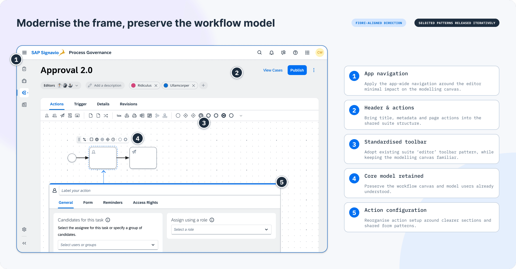
The workflow editor's core canvas and model stayed intact while its surrounding structure and controls were modernised. Each change could ship independently, while together they created a more coherent app-wide experience.

The navigation-led prototype brought task completion, workflow management, and editing into one coherent app direction that stakeholders could experience together.
The Task direction combined suite navigation with clearer intra-task movement, metadata, form hierarchy, and a consistent information panel.
The Workflows direction replaced legacy tabs and side-panel filtering with shared navigation, chip filters, a consistent page header, and the suite table pattern.
The Editor direction modernised navigation, headers, toolbars, and action configuration while deliberately preserving the familiar workflow canvas and model.

03 /

Solution

I brought the direction together in a high-fidelity prototype spanning Tasks, Cases, Processes, and Analytics. It introduced persistent side navigation, consistent page framing and headers, and shared patterns for forms, tables, filters, panels, and toolbars.

The workflow editor's core canvas and model stayed intact while its surrounding structure and controls were modernised. Each change could ship independently, while together they created a more coherent app-wide experience.

The navigation-led prototype brought task completion, workflow management, and editing into one coherent app direction that stakeholders could experience together.
The Task direction combined suite navigation with clearer intra-task movement, metadata, form hierarchy, and a consistent information panel.
The Workflows direction replaced legacy tabs and side-panel filtering with shared navigation, chip filters, a consistent page header, and the suite table pattern.
The Editor direction modernised navigation, headers, toolbars, and action configuration while deliberately preserving the familiar workflow canvas and model.

04 /

Outcome

Delivered
Fiori-alignment work released selected parts of the direction, including side navigation, the page-header pattern, updated form fields, and standardised table/list patterns.

Enabled
Product and engineering gained a phased path to modernise the app without waiting for a whole-app rebuild.

Clarified
The work established a coherent, implementation-ready direction for improving the legacy product through small, cumulative changes focused on everyday user friction.